
The Psychology of Color in Advertising and 5 Key Colors

Color psychology delves into the captivating realm of how colors wield psychological and emotional influence over human behavior and perception. The array of colors has the ability to stir diverse emotions, thoughts, and sensations, holding the power to remarkably sway our moods, choices, and even our physiological reactions.
If you are looking for exciting ideas for creating advertising photos, be sure to visit the portfolio page of Studio NextShot.
What does Color Psychology entail?
Color psychology involves the examination of how colors can impact human behavior, emotions, and perceptions. It delves into the concept that different colors can evoke distinct feelings and reactions in people. This field explores the emotional and psychological influence that colors wield across various aspects of human life, including design, branding, marketing, and even personal wellness.
Colors possess the ability to convey messages, set moods, and influence decision-making. Color psychology seeks to fathom the connections individuals establish with various colors and how these connections can be harnessed to shape human responses. For instance, specific colors might be employed in marketing to seize attention, project credibility, or arouse appetite.
Yet, it’s crucial to acknowledge that color psychology isn’t universally rigid. Cultural disparities, personal experiences, and individual preferences all mold how people perceive and react to colors. While color psychology provides insights into potential color effects on the human psyche, it’s just one fragment of a larger picture encompassing design, context, and personal interpretation.
Unlocking Creativity, Discover the World of Online Photo Editors
What makes color psychology essential in the field of marketing?
Color psychology holds a captivating role in marketing due to its ability to stir emotions and elicit sentiments. The selection of colors for your business carries substantial significance, as it can determine whether your brand captures attention amidst the crowd or gets lost within it. Skillfully utilizing colors in your marketing endeavors enables you to guide your audience’s perception and shape their understanding of your intended identity. This underscores the immense utility of comprehending color psychology for your marketing pursuits, as it empowers you to artistically convey your brand’s essence.
While adept color choices can elevate brand perception, making ill-suited color selections can inflict harm upon your brand’s image. For instance, opting for inappropriate colors in your content or logo can render them less legible, making it arduous for your audience to grasp. There’s even the risk of being disregarded entirely.
In the hands of marketers, color becomes a tool to sway how individuals think and act in relation to a brand, as well as how they interpret presented information. The palette of colors chosen can significantly impact individuals’ determination of what holds significance. This underscores why content marketers should possess a comprehensive grasp of the meanings associated with various colors.
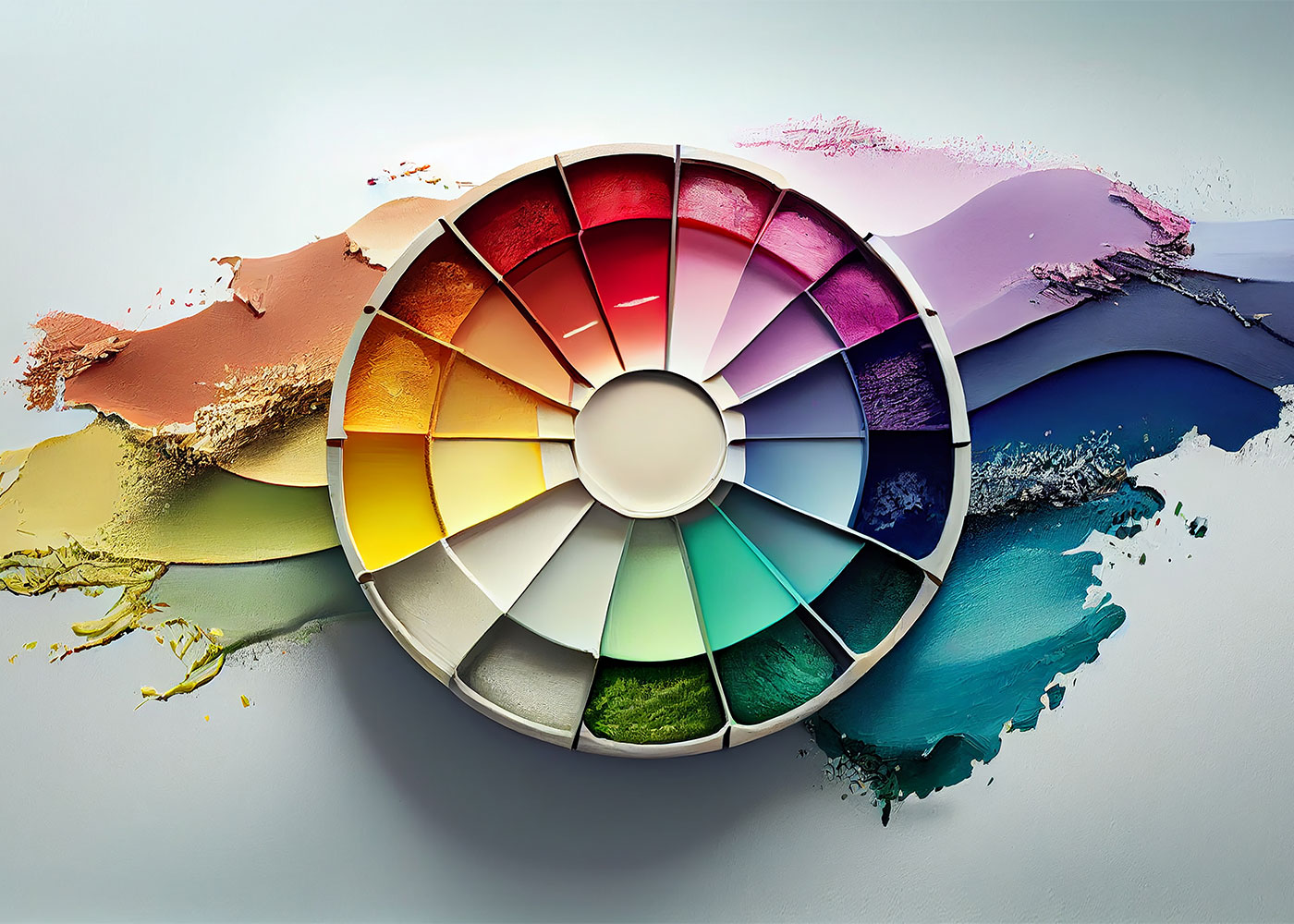
List of Color Symbolism
Color Psychology – Red Color Significance
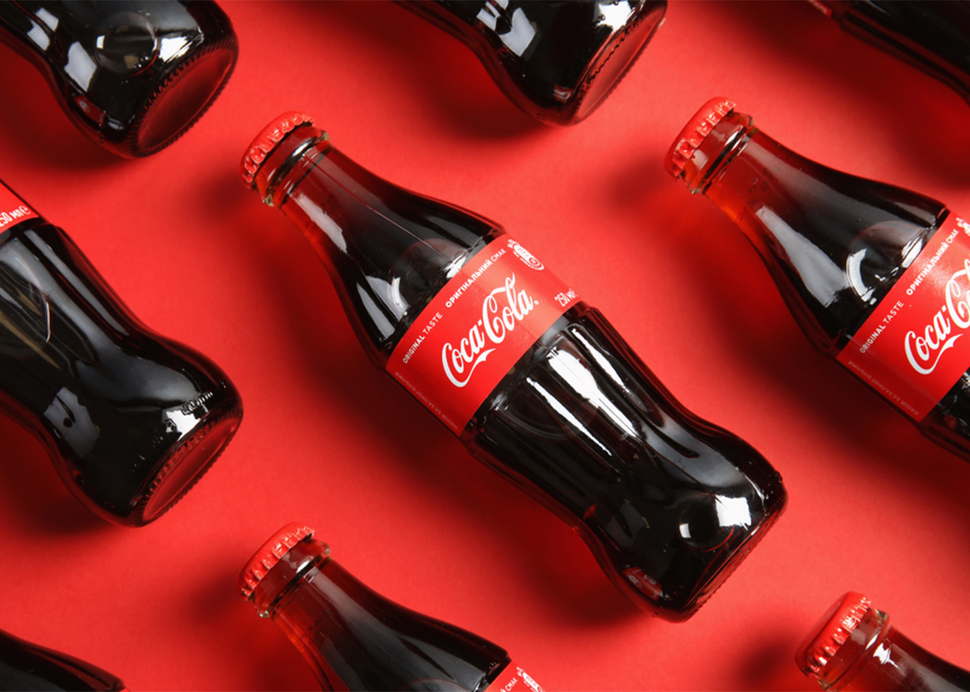
In the realm of marketing, hues like red possess the ability to seize attention. The meaning behind the color red aligns with excitement, passion, energy, danger, and action. Notably, brands employ red for “order now” buttons and packaging, aiming to stand out on shelves. In color psychology, red stands as the most potent hue, capable of evoking intense emotions. However, its association with danger suggests prudent use. Incorporating red into your website should be reserved for impactful call-to-action elements or sale indicators that harmonize effectively with your store’s design.
Renowned brands like Coca-Cola and YouTube opt for the iconic red. Coca-Cola employs red to stimulate appetite, complementing its happiness-focused branding. Similarly, YouTube uses red to evoke the excitement of watching videos, evident in its play button logo segment that prompts action.
Orange Color Symbolism
Color psychology assigns creativity, adventure, enthusiasm, success, and balance to orange. This shade injects a touch of fun into images, websites, and marketing materials. While captivating, orange lacks the commanding presence of red. Marketers still employ it for call-to-action elements or website sections deserving attention.
Nickelodeon and The Home Depot embody orange’s symbolism. Nickelodeon’s playful orange logo resonates with the creativity and enthusiasm expected in children’s programming. Meanwhile, The Home Depot’s orange emblem aligns with the DIY spirit and the creativity associated with home improvement projects.
Color Psychology – Yellow Color Connotations
Yellow’s color meaning is rooted in sunshine, evoking happiness, positivity, optimism, and summer. Yet, it also carries connotations of deceit and caution. Select brands opt for a cheerful yellow backdrop or border for website design, or to highlight “free shipping” bars. A touch of yellow can forge positive associations with your store.
Prominent brands like Ferrari and Ikea incorporate yellow. Ferrari represents luxury, happiness, and carefree living, while Ikea’s yellow complements the joy and optimism of furnishing a new home.
Pink Color Interpretation
Pink resonates with brands targeting a female audience. In color psychology, pink embodies femininity, playfulness, innocence, and unconditional love. Brands utilize pink in product packaging for girl’s toys or to emphasize logos, websites, and key messages.
Victoria’s Secret and Barbie embrace pink symbolism. Victoria’s Secret aptly names a brand “Pink,” incorporating pink and black on their website to highlight marketing details. Barbie’s website employs pink for CTAs, navigation, and logo, reinforcing feminine associations.

Green Color Significance
Color psychology links green with nature and wealth. Growth, fertility, health, and generosity are positive attributes, while envy presents a negative facet. Health and fitness brands might integrate green elements into their store design, such as banners or logos.
John Deere and Roots popularize green. John Deere’s nature-focused branding aligns with landscaping and agriculture, while Roots draws on green for its strong association with nature, even extending to its equipment.
Challenging Color Psychology Myths
Color psychology, though captivating, can be susceptible to misconceptions that need debunking:
Universal Reactions: The idea of consistent color responses worldwide doesn’t hold true. Cultural context and personal experiences shape how colors are perceived.
Oversimplified Influence: The notion that colors guarantee specific emotions is overly simplistic. Colors are just one facet of feelings, intertwined with individual connections.
Cultural Interpretations: Colors don’t possess fixed meanings across cultures. White, for instance, signifies mourning in certain Asian societies, unlike its purity symbolism in the West.
Unvarying Solutions: Applying a single color theory universally isn’t accurate. Effective color application depends on industry, target audience, and brand identity.
Dominant Impact: While colors impact emotions, they don’t singularly dictate behavior. Decisions involve various factors, including product quality.
Isolated Color Impact: Considering color in isolation neglects overall design harmony. Effective outcomes stem from synchronized color, typography, and layout.
Predictable Responses: Assuming uniform reactions to a color oversimplifies psychology. People’s responses are intricate and diverse.
Subconscious Control: While colors hold influence, they’re not tools for mind manipulation. Consumers are increasingly savvy about marketing strategies.
Instantaneous Effects: Colors don’t promise immediate actions. Successful branding entails consistent color integration over time.
Neglecting Personal Differences: Overlooking individual preferences dismisses the richness of personal histories that shape color perceptions.
Leveraging color psychology effectively requires grasping its intricacies and sidestepping these myths. It’s a dynamic tool, not a magical fix.
Conclusion about Color Psychology:
In conclusion, color psychology is a fascinating and influential aspect of human perception and behavior, particularly in the realm of marketing. While it’s true that colors can evoke emotions and shape perceptions, it’s important to approach the subject with a nuanced understanding, avoiding common misconceptions. Colors do carry significance, but their impact varies across cultures, individuals, and contexts, challenging the notion of universal reactions. The belief that colors have a direct and simplistic influence on emotions or actions oversimplifies the intricate interplay of psychology and personal experiences.
Recognizing the cultural nuances and individual differences associated with color meanings is crucial for effective marketing. Brands can leverage color symbolism to create associations that resonate with their target audiences, but they must do so with a holistic approach that integrates color harmoniously into overall design elements. While color can indeed play a role in conveying emotions and messages, it’s just one piece of the larger puzzle that encompasses branding, content, and consumer engagement.
As marketers and designers, it’s essential to navigate the realm of color psychology with care, avoiding assumptions and embracing the complexity of human responses. By dispelling misconceptions and appreciating the subtleties, we can harness the power of color to enhance brand perception, engage audiences, and create meaningful connections that go beyond a mere color palette.


Comments are closed.